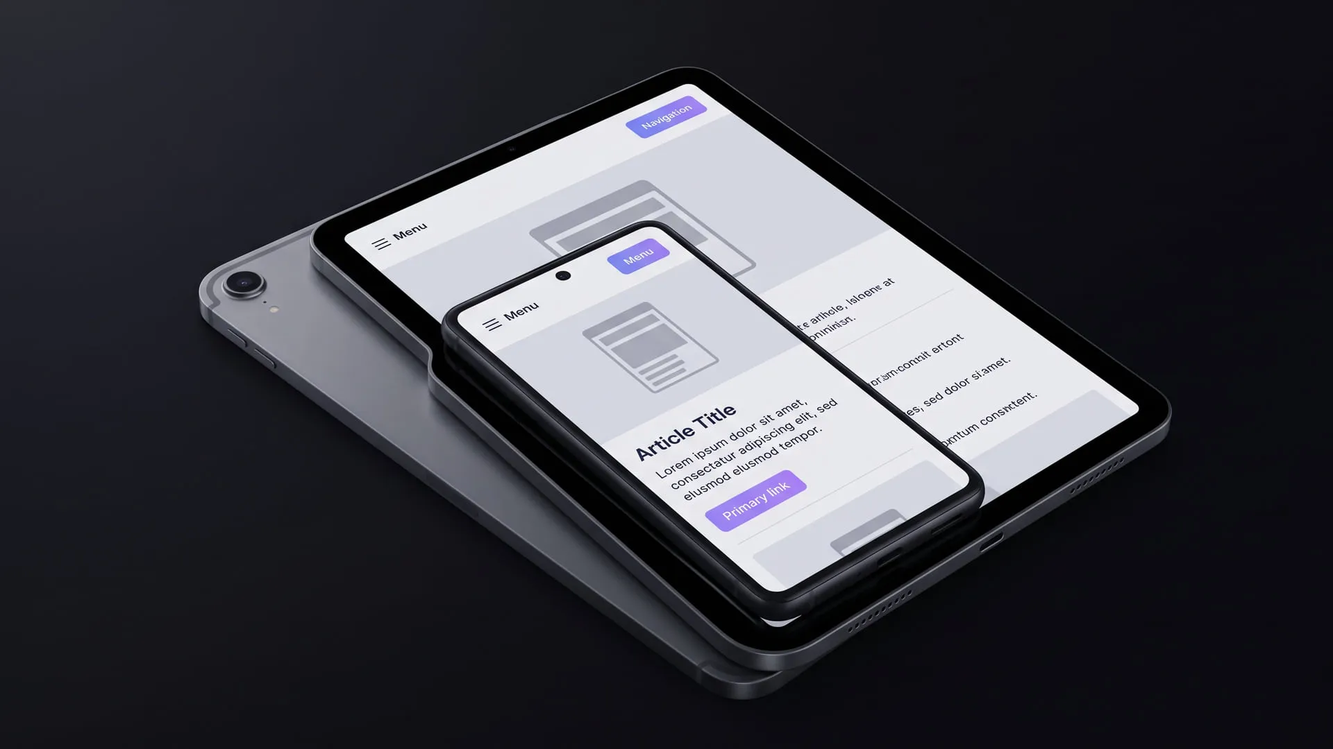
Responsive design: mobile-first CSS
What the mobile-first CSS approach is and how to use media queries to keep a single interface looking right across different screen sizes.
Category
HTML, CSS and frontend interface development: layout, component design and browser behaviour. (Page 3/4)
This category has 19 posts.
What the mobile-first CSS approach is and how to use media queries to keep a single interface looking right across different screen sizes.
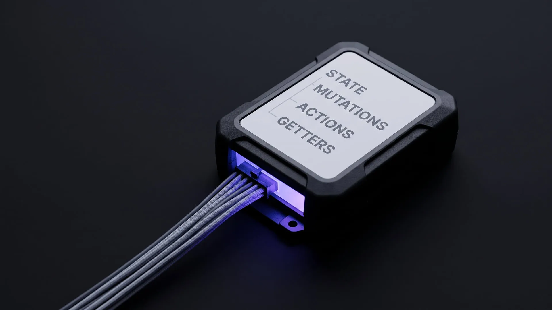
Centralizing shared state across components using Vuex: state, mutations, actions, and getters explained.
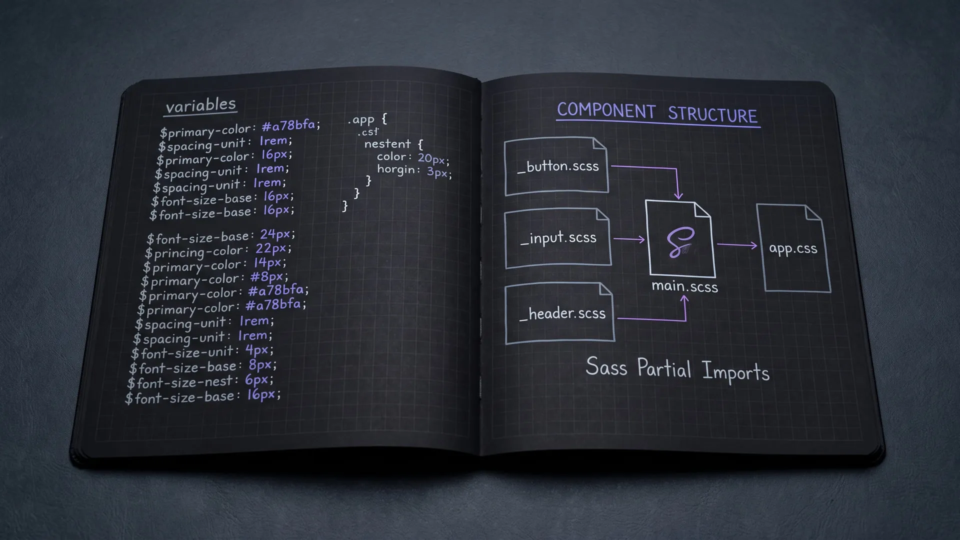
How I bring structure to growing stylesheets using Sass variables, nested rules, and file partials.
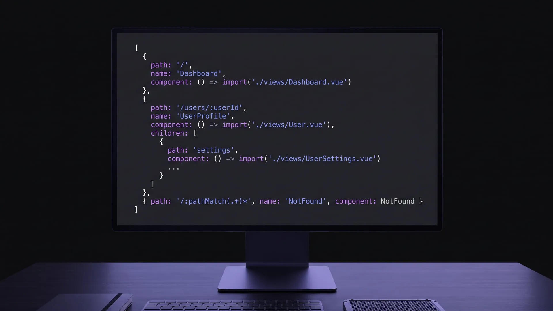
A walkthrough of the core concepts and practical setup I encountered while moving page transitions to the client side with Vue Router.

My experience moving from jQuery DOM manipulation to Vue.js's data-driven approach, and how I wrote my first reactive component.
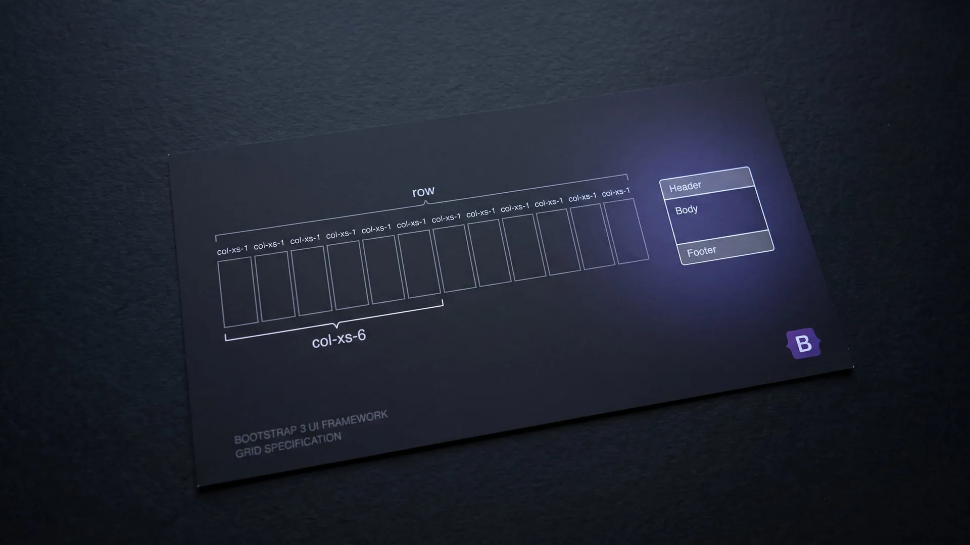
How to produce decent-looking interfaces without a designer: Bootstrap 3's grid system and ready-made components.